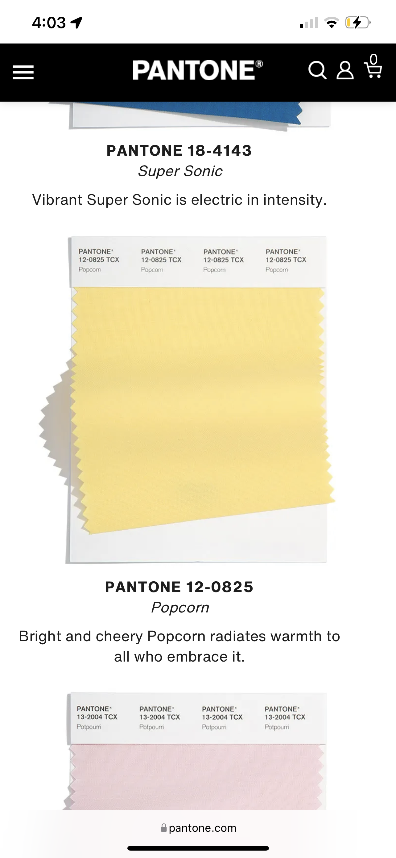
Colour Forecast 2022
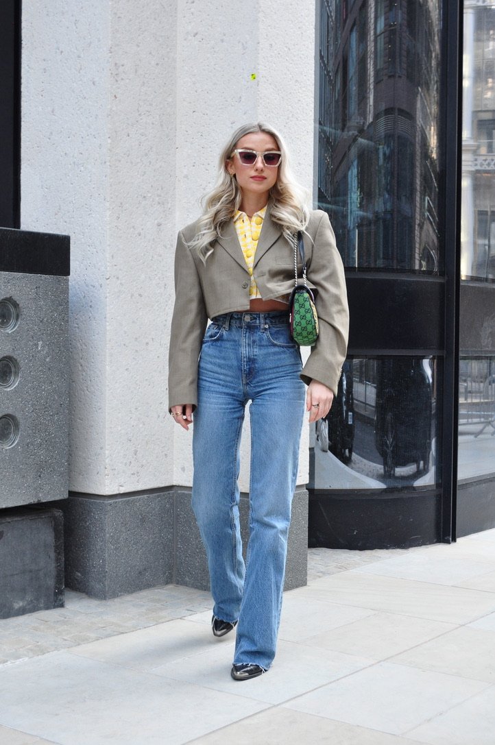
Outfit Details: Top: Zara, Blazer: Vintage, Jeans: Zara, Boots: TK Maxx (Zara), Bag: Gucci, Sunglasses: & Other Stories
Happy Sunday lovelies
Hope you’re all having the best weekend and Happy Mother’s Day to all the amazing mums out there, especially mine, who I’m quite partial too and believe is the best mum anyone’s ever had. While I spent time with my mum last weekend, I was back in London this weekend. Yesterday, my friend, Millie and I had an outfit shoot day and ended with some delish pasta from Lina Stores, which I’ve been wanting to try to ages. (We both got the carbonara and would def recommend.) Today I had brunch, in true George form, with none other than my gorgeous friend, Zoe and her puppy Odie, who I’ve been wanting to meet for ages! He was such a little dream. Much to Odie’s jealousy, Zoe and I had the banana pancakes from Granger & Co. They were to die for.
Anyway, now that the UK weather seems to have finally broken and we’re heading into April soon, I thought it was about time I post my annual colour forecast for Spring/Summer 2022. (Check out last year’s colour forecast here.) As usual, I’m covering this year’s most popular shades, according to Pantone, and how you can wear them.
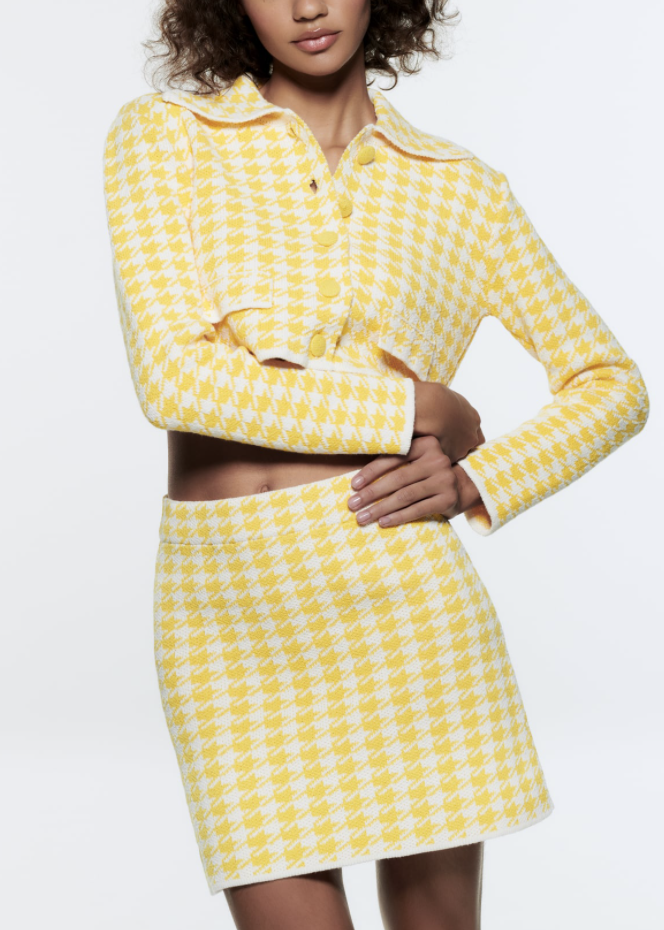
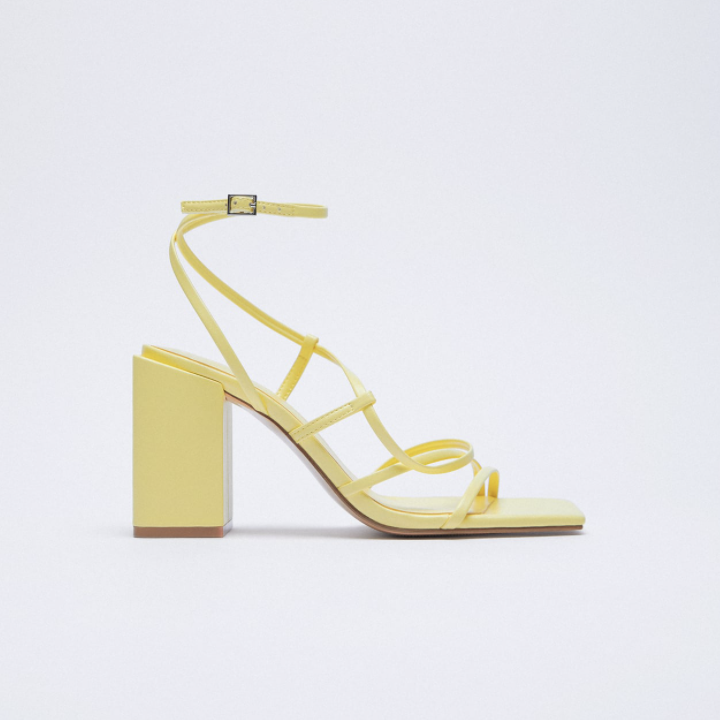
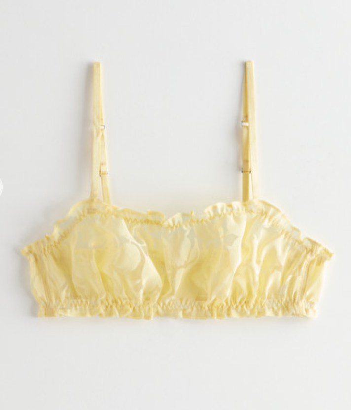
Popcorn
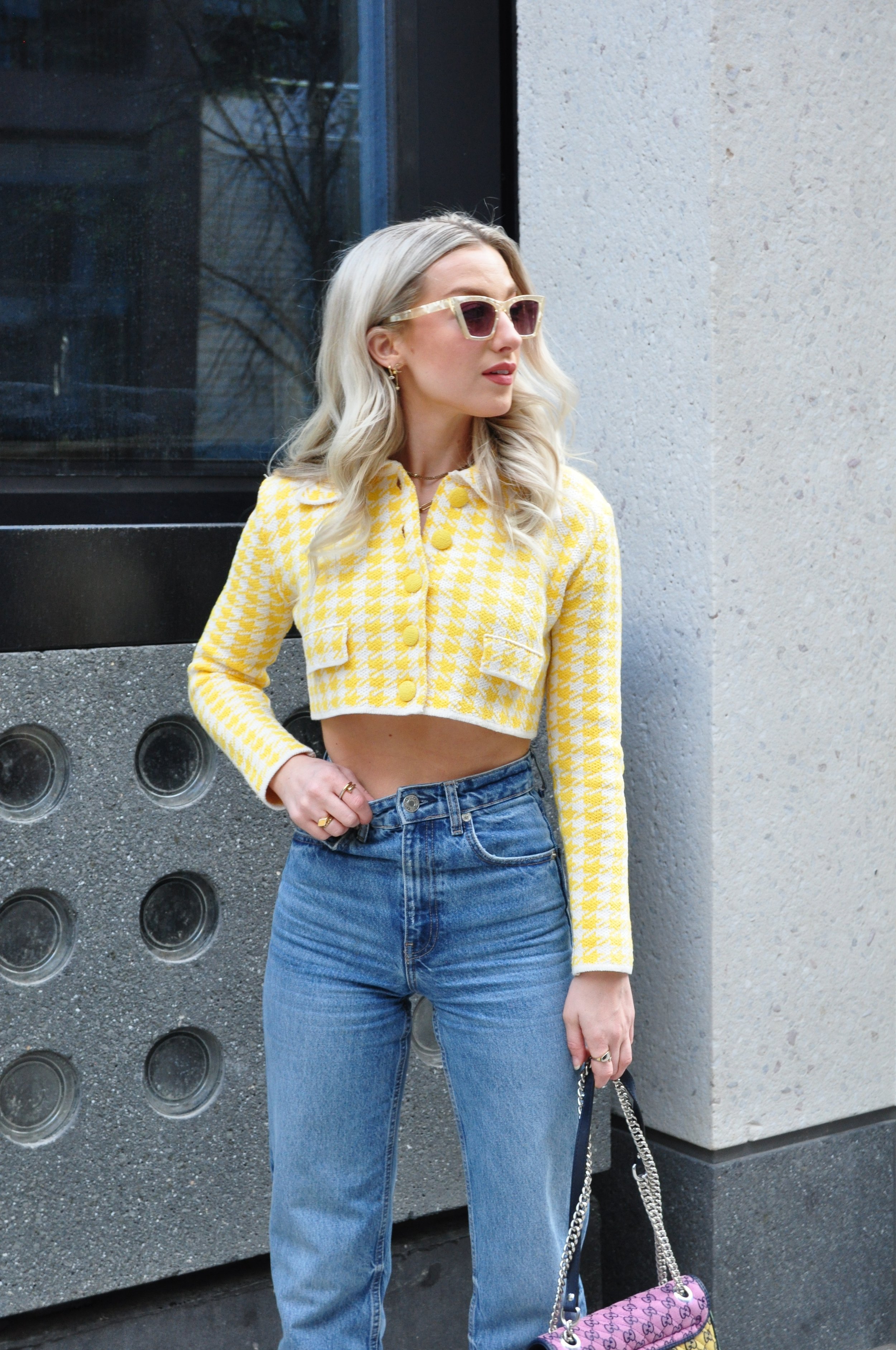
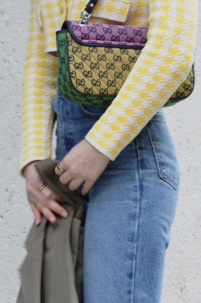
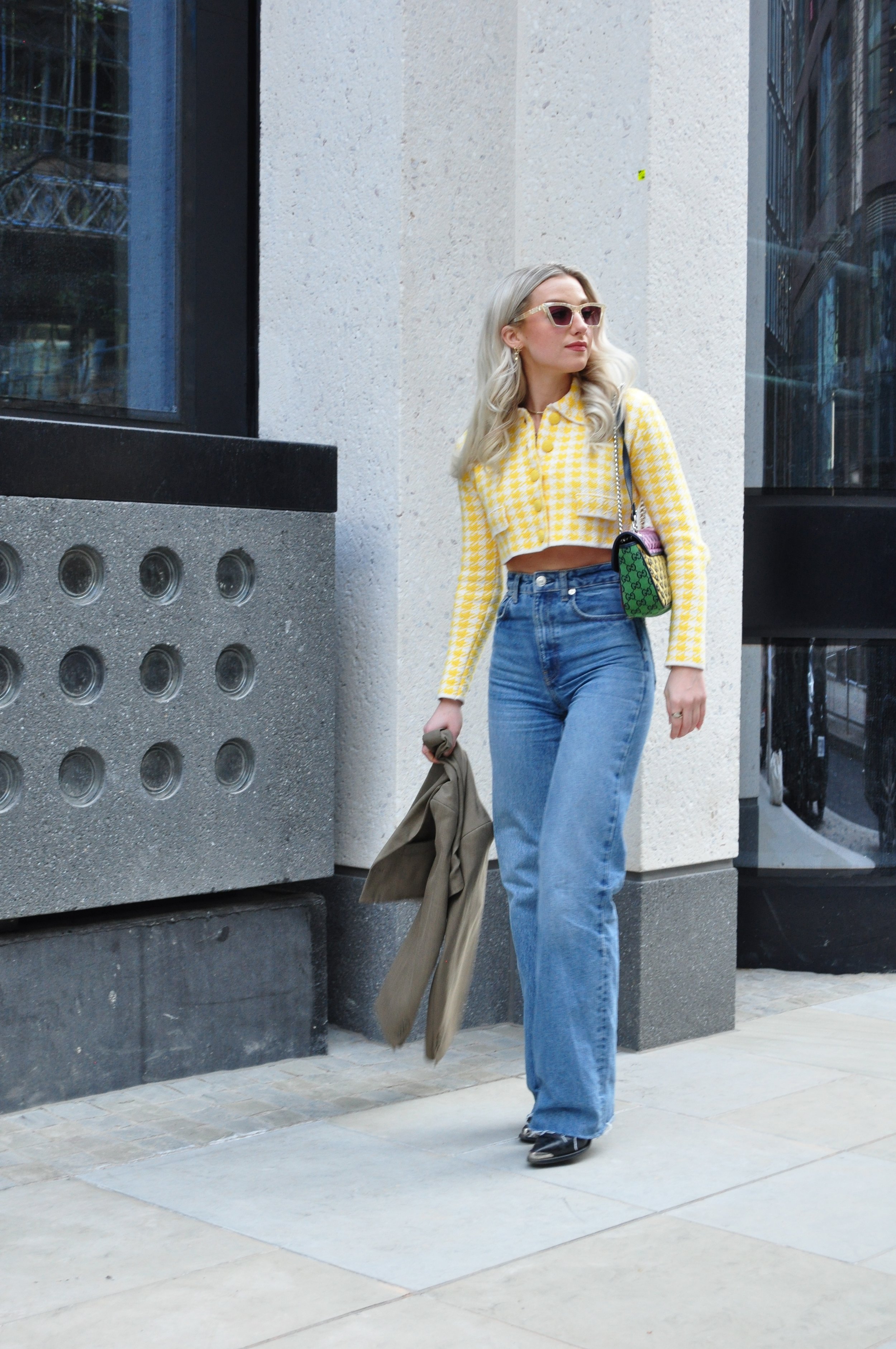
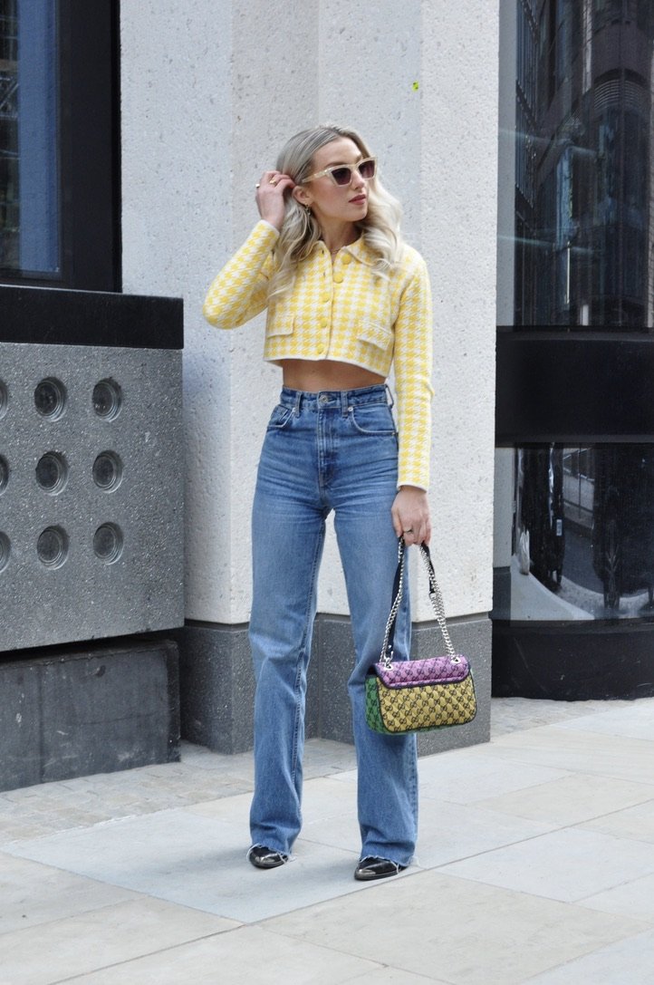
First up, Popcorn is the main feature of this outfit, aka this adorable little houndstooth top from Zara that I’ve been wearing non-stop. It’s a bright and cheery shade that kind of makes you smile when you wear it. Yellow is not normally a colour I wear much, but popcorn seems a bit more wearable since it’s a bit subdued. I recommend pairing with denim like I did here for all the spring vibes.
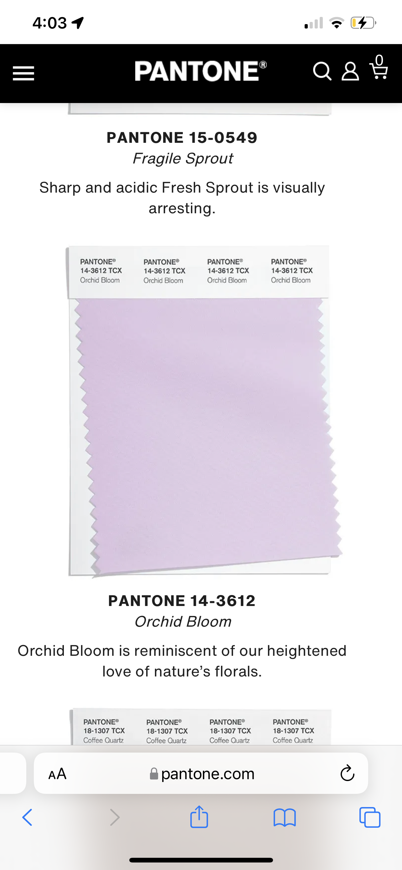
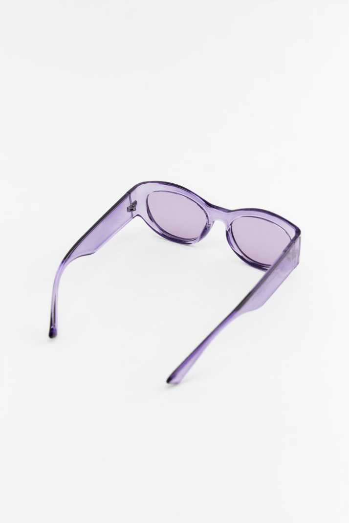
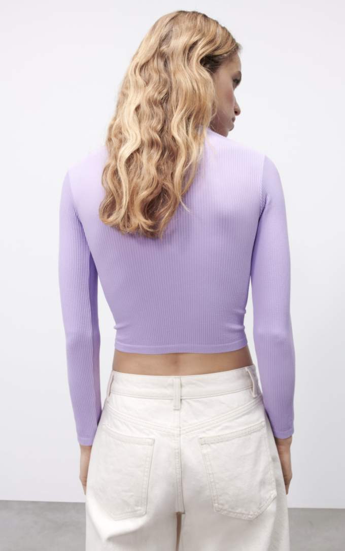
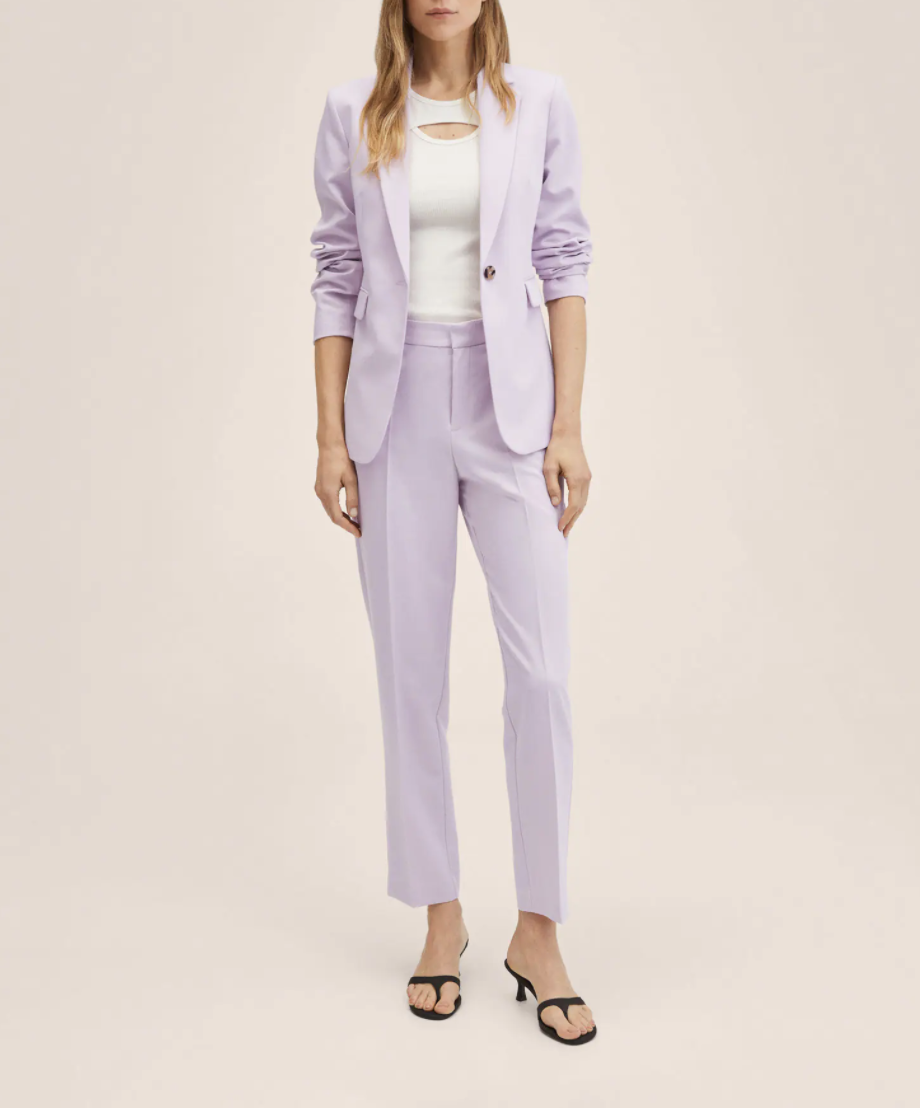
Orchid Bloom
Orchid bloom is the colour of the year I believe. (Purple is very in this year if you haven’t already caught on.) Orchid bloom is quite an easy one to wear and will compliment most, even if you don’t wear much purple, because again, it’s quite subtle. Imagine a gorgeous suit in this shade!
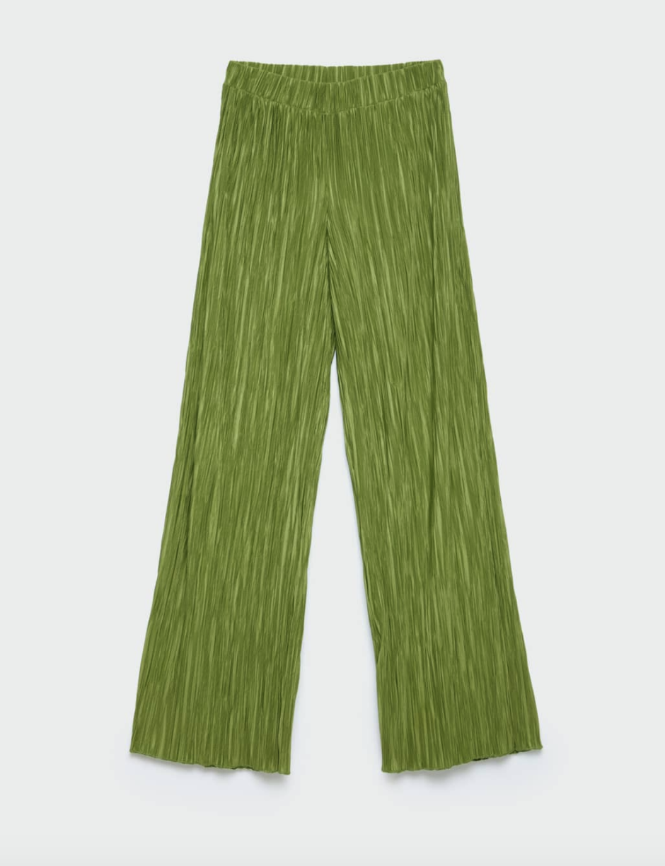
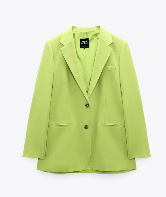
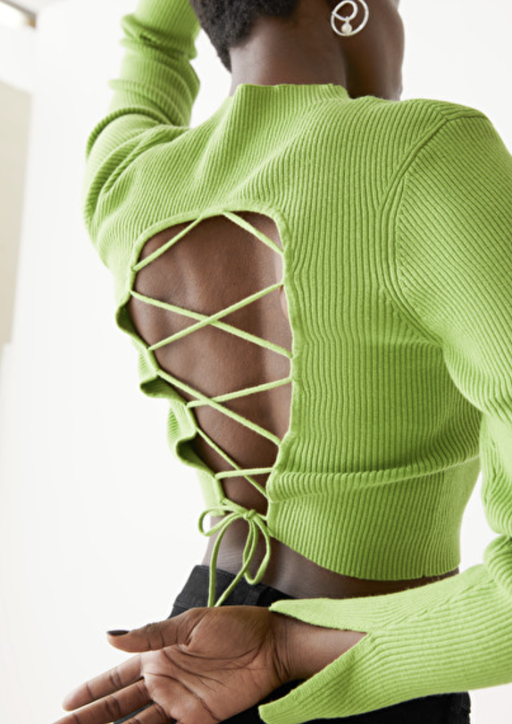
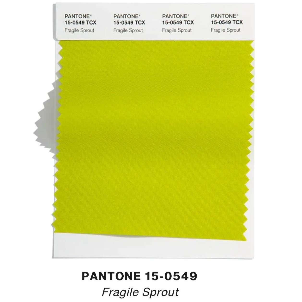
Fragile Sprout
Fragile Sprout is the unlikely addition and maybe the hardest colour to wear of the bunch. It’s not for the faint of heart or the neutral Nellys that’s for sure. The colour is described by Pantone as sharp and acidic and I couldn’t agree more, but I do love it. I’ve recently bought a plisse set that’s this unique hue (shop below). To pull off this shade, I recommend pairing with soft neutrals such as a light beige.
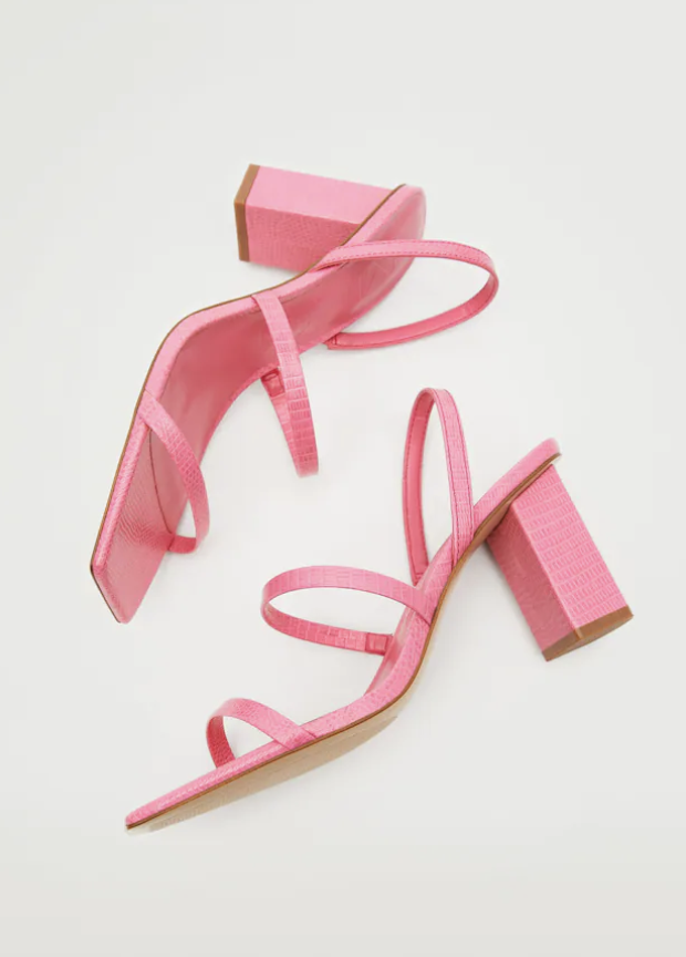
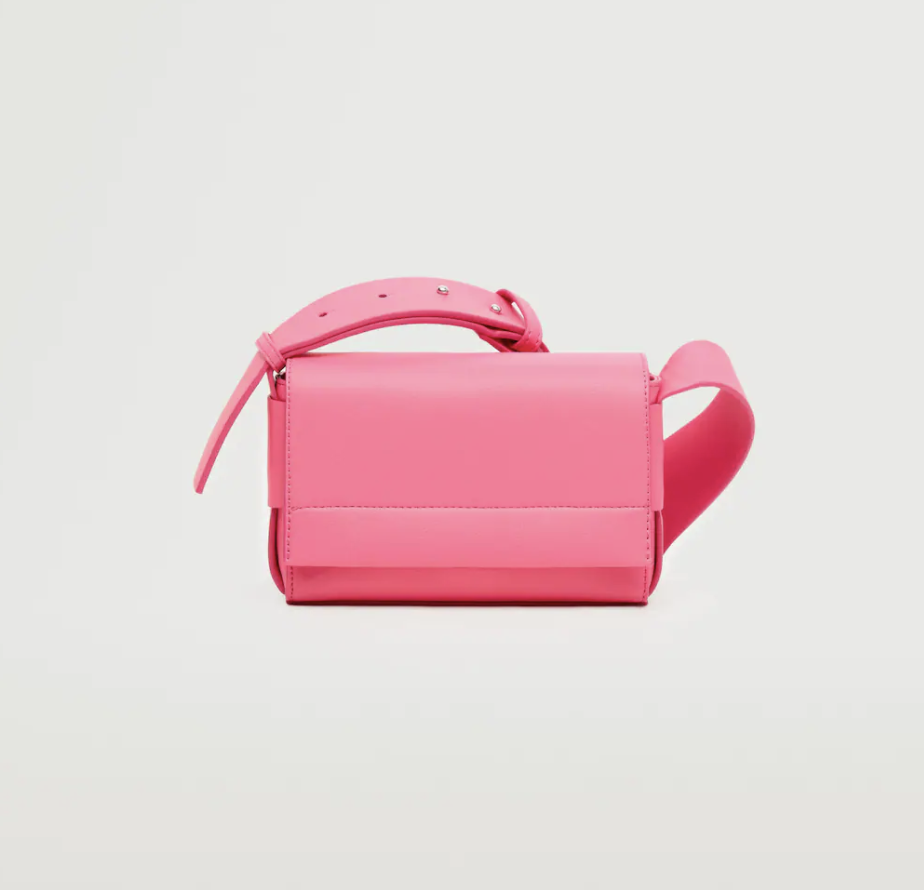
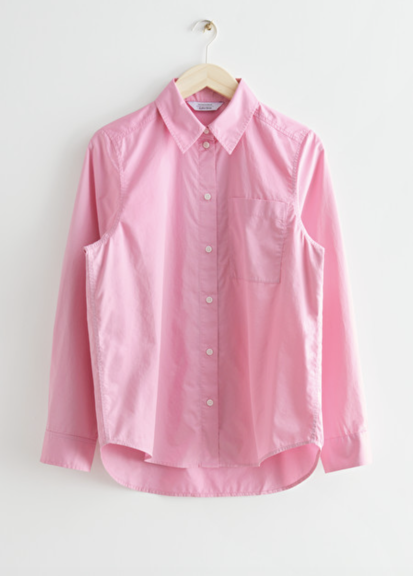
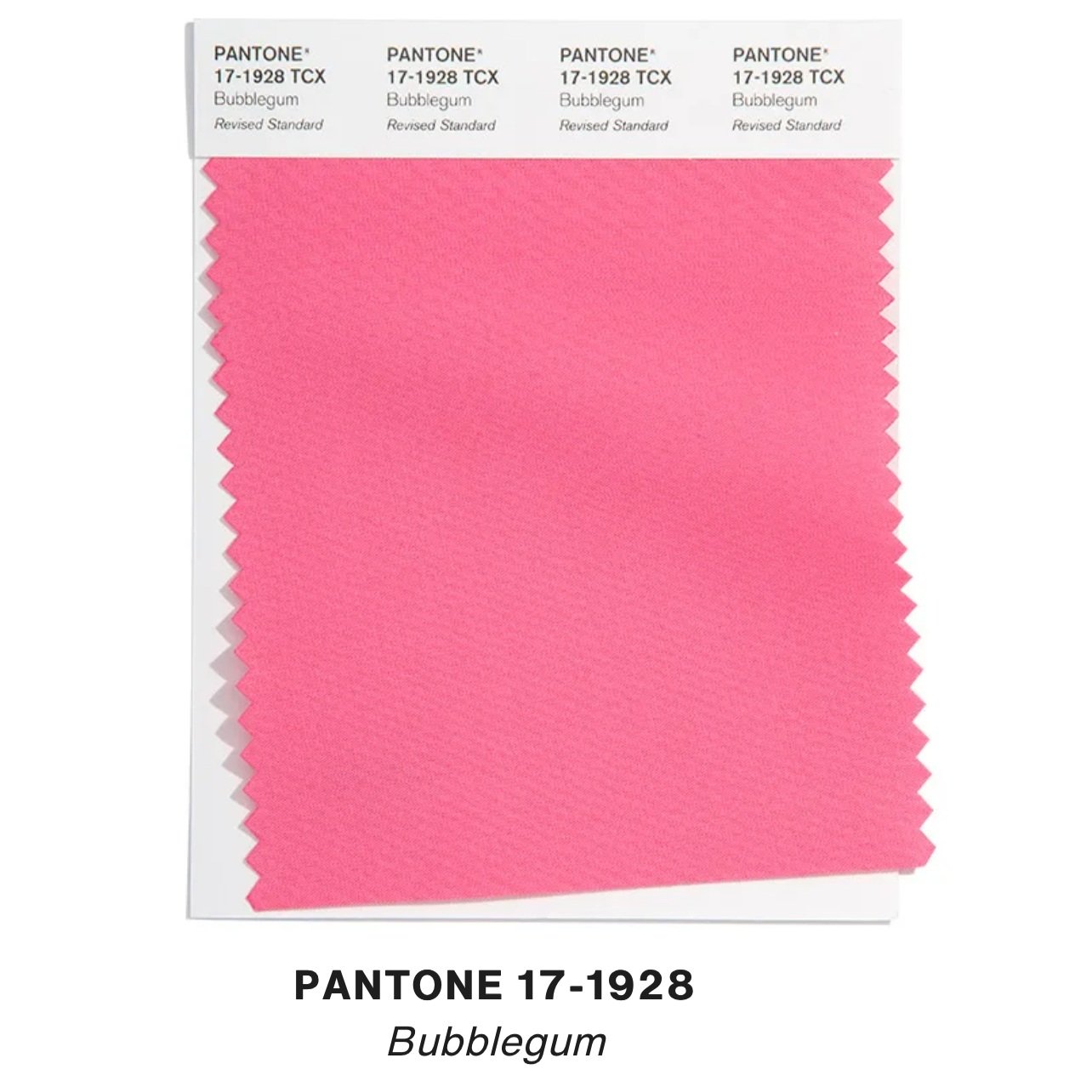
Bubblegum
Bubblegum is back! A bright and punchy pink always seems to crop up time and again this time of year. As Pantone describes, it sends a message of positivity and playfulness which I think we’re all feeling now that the sun is deciding to show it’s face again! If you’re feeling brave, colour-block with Super Sonic blue or wear with denim, but if you’re a bit more cautious you can use it as the perfect pop to any neutral look.
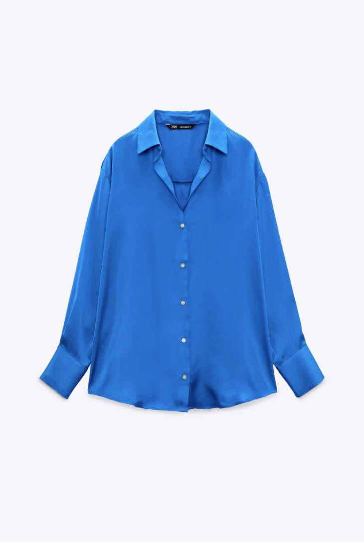
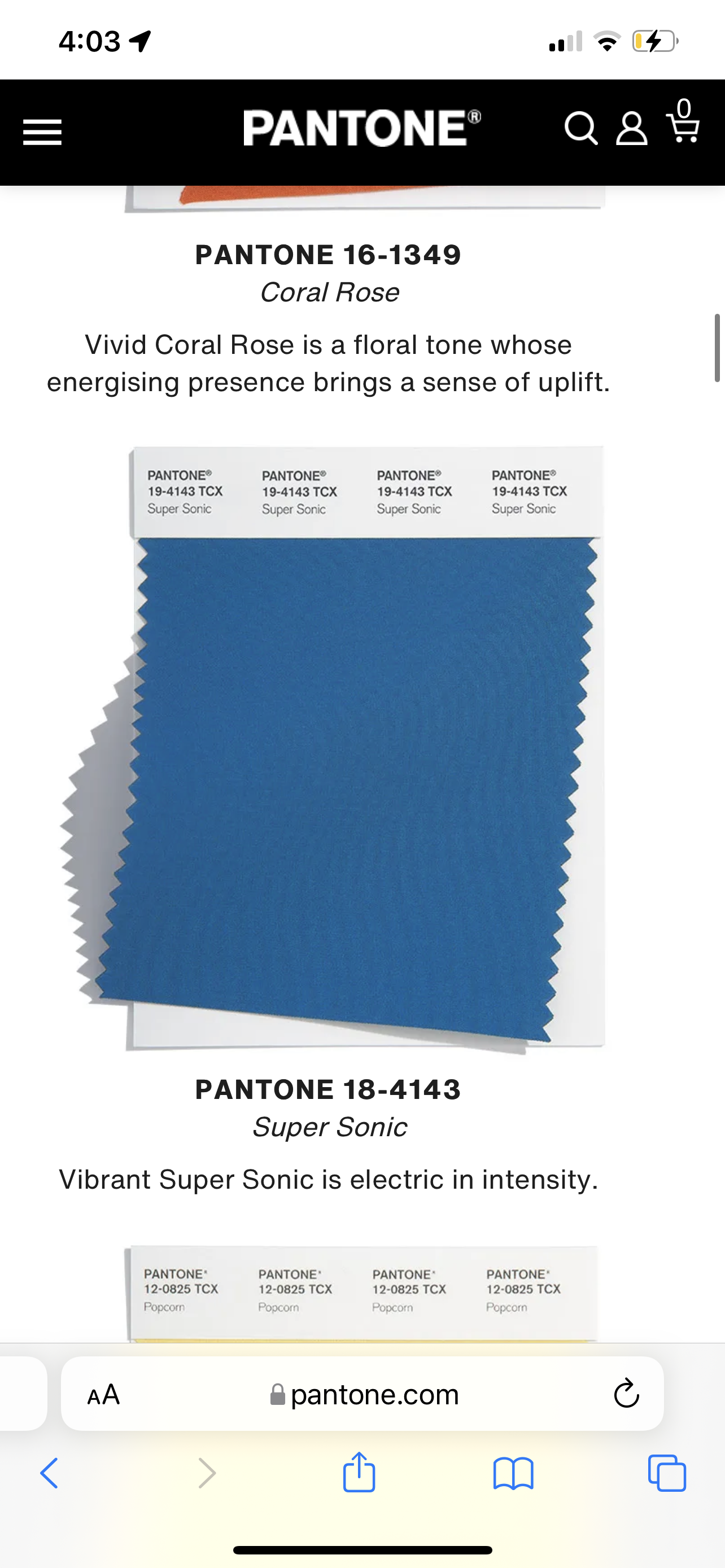
Super Sonic
Super Sonic will again suit almost everyone and you can also think of it in terms of a shade of mid-wash denim as well. This shade is bright but not intimidating, so pair this with whites, pinks, and even yellows for the perfect spring/summer outfit. It reminds me of the roof tops in Santorini Greece, which feels very fresh and beachy.
Thank you for reading this year’s colour forecast. Shop some of my favourite spring pieces in these hues below. Comment which colour you think you’ll wear the most below. This is my 6th year doing colour forecasts in a row! (Check out all the others here.) I had a look down memory lane and went through my old colour forecasts to see how the trending hues have changed, which was fun. Anyway, a special thank you goes to Millie for taking these photos for me and check back next week for a new post. In the mean time follow me on Instagram for daily updates!
George x
shop spring