Adding Color to Your Fall Wardrobe

Hello lovely readers,
I hope all of you had an awesome week. I don't know about you, but my week has been very busy, so I'm happy to just be sitting, writing, and chatting with you guys.
Typically, fall consists of darker colors like jewel toned greens, deep burgundies, and and burnt oranges, but I've decided to incorporate some other colors into my fall wardrobe, just to spice it up. You can never go wrong with a pop of color.
Below is Pantone's Fashion Color Report for Fall 2016. These are colors that were seen all over the runways of fashion week for the fall season. Try these colors if you're feeling bored by the typical fall shades. In particular, I'm really loving the golds, mauves, and cool blues.
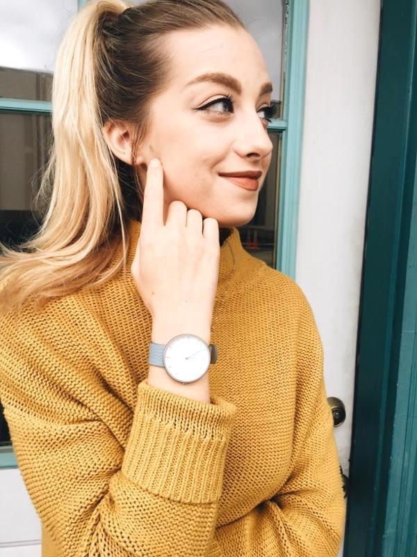
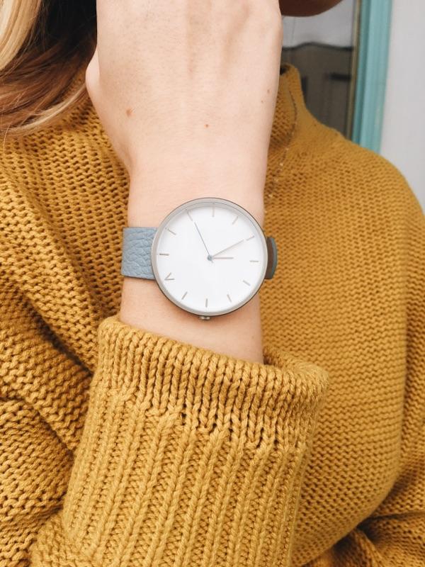
Now, let's get on to my outfit. The stars of this outfit are my gorgeous coral bucket bag form Poupée de Papier and my The 5th Watch, so let's talk about their details.

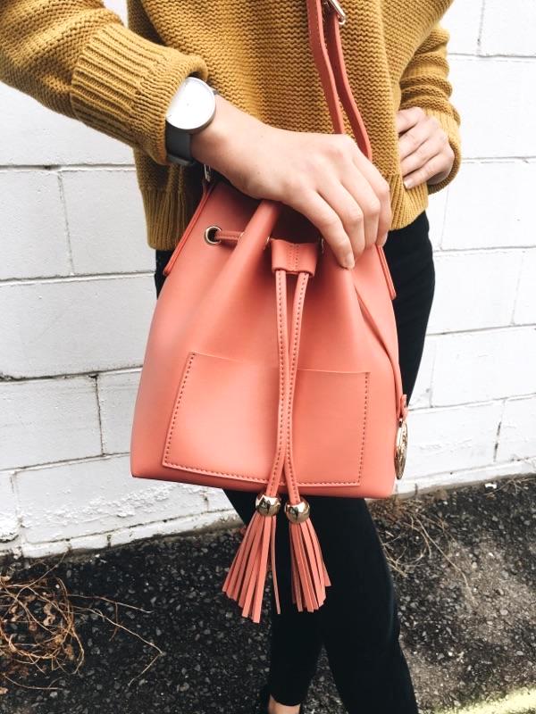

This gorgeous bucket bag is the perfect pop of color to add to your dark fall wardrobe. Poupée de Papier have the most colorful and gorgeous bags, and they're letting me take over their Instagram Stories today, so if you want to follow my day, go check out their Instagram!
The 5th Watch is a minimalist's dream watch and is called the Natsu Tokyo. Its clean design always gains some compliments, and the pale blue band is another color perfect for this time of year. You should definitely check out their website for an amazing array of watches.
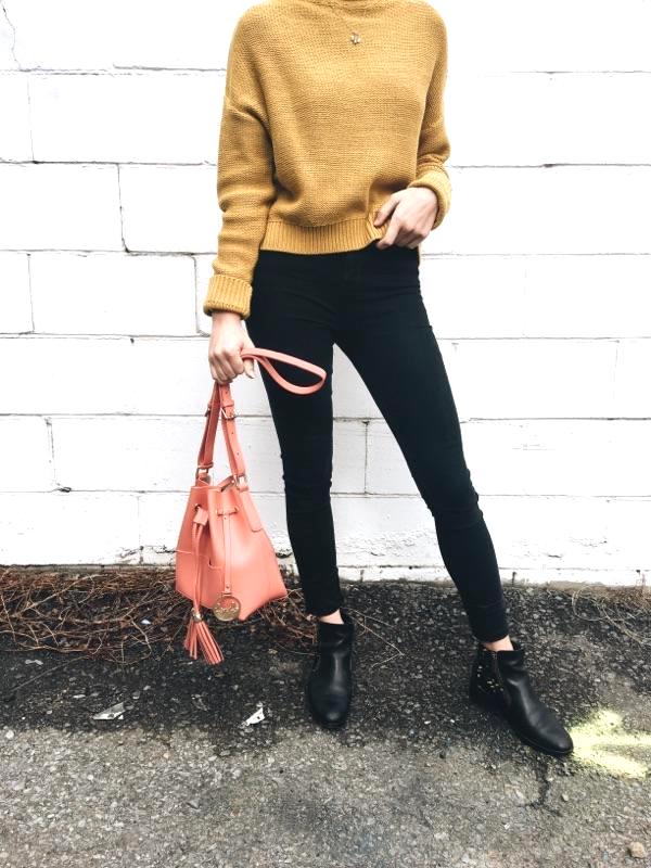
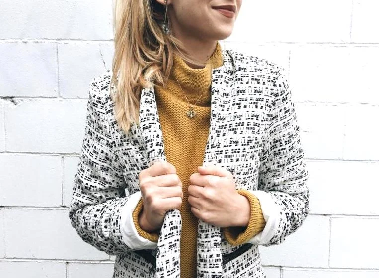
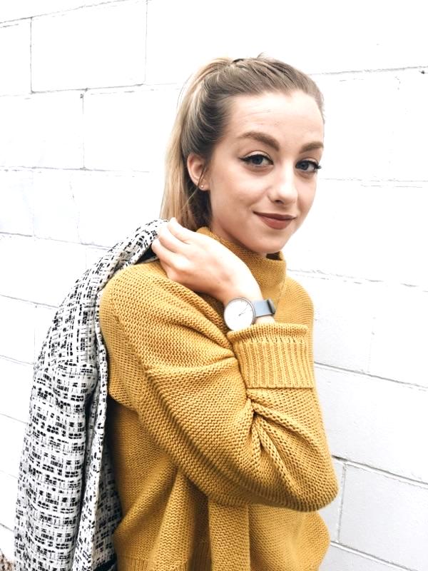
I paired them with this cozy sweater and textured coat from Gibson. I also added my classic black skinnies and Cole Hann boots as my neutrals.
Outfit details: Bag: Poupée de Papier, Jacket: Gibson, Watch: The 5th Watches, Sweater: Old Navy, Jeans: UO BDG, Boots: Cole Hann.
As always, thanks for reading along and I hope you join me again for another post next week! Comment below which color of Pantone's Fall Colors you are most excited to wear.
Georgie x